InsightEdge
Mental health platform: patient app and therapist dashboard. Product design; the implementation was someone else's.
Project Info
Methodology
Summary
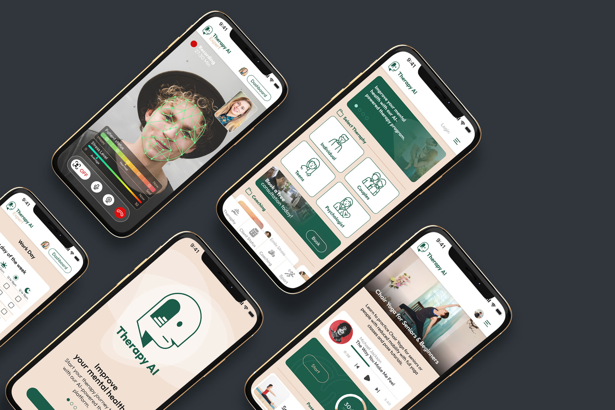
InsightEdge is a mental health platform in two halves: an app patients use daily, and a panel where their therapist reads what it recorded. I designed both. The implementation was someone else's.
The Challenge
A therapist sees a patient for an hour a week and reconstructs the other 167 hours from memory, the patient's and their own. Patients, meanwhile, rarely know what is worth tracking.
The goal: capture stress, mood and activity between sessions, and turn it into something a therapist can read in the fifteen minutes before an appointment.
My role: product design across both sides of the platform. I did not build this one.
Two products, one problem
A therapist sees a patient for an hour a week and has to reconstruct the other 167 hours from memory, the patient's and their own. InsightEdge closes that gap from both ends: an app the patient uses daily, and a panel where the therapist sees what it recorded.
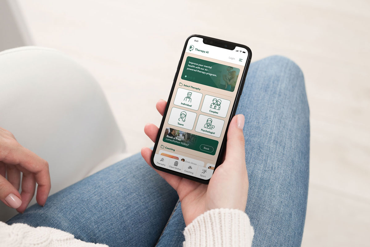
The patient app
Three things a patient does between sessions, kept to three so the app survives a bad week:
Therapy
Booking and video consultation with their therapist.
Daily status
Mood and stress, logged in one tap on a three-point scale. Anything longer does not get filled in on the days that matter most.
Coaching and activity
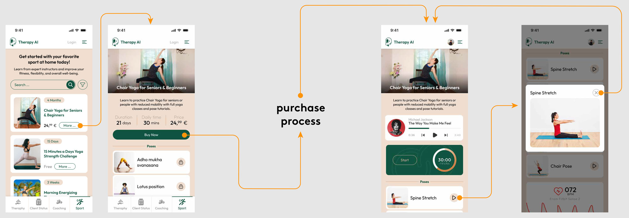
Physical activity and coaching in the same place as the tracking, so the app suggests something to do rather than only asking how you feel.
The therapist panel
The same data, read by someone with fifteen minutes between appointments:
- Patient status over time, so a pattern is visible before the session starts rather than recalled during it.
- AI summaries of recorded sessions and daily logs, surfaced as something to look at rather than a transcript to read.
- Scheduling, working days, and professional credentials in one profile.
What I decided
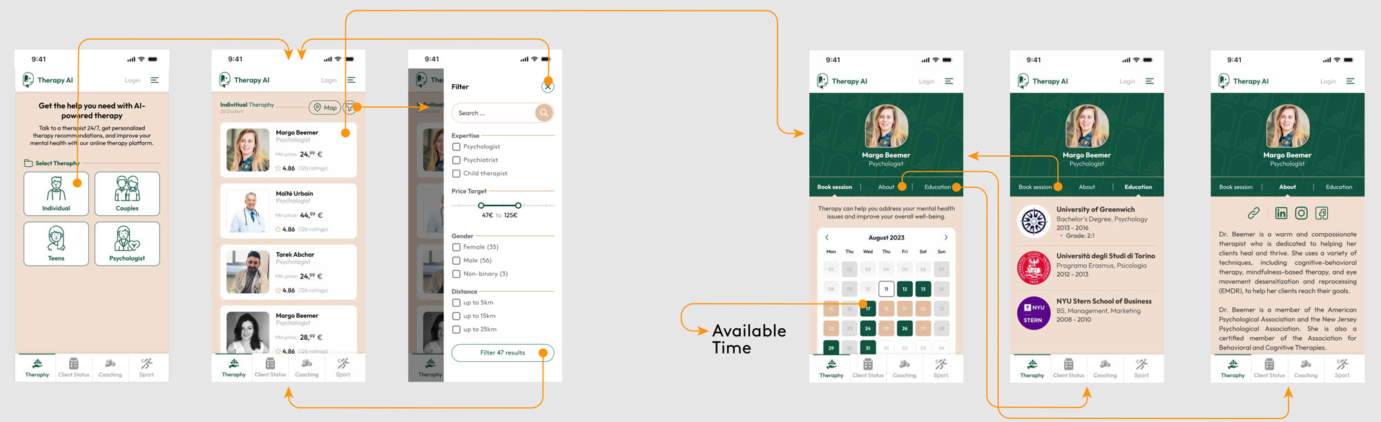
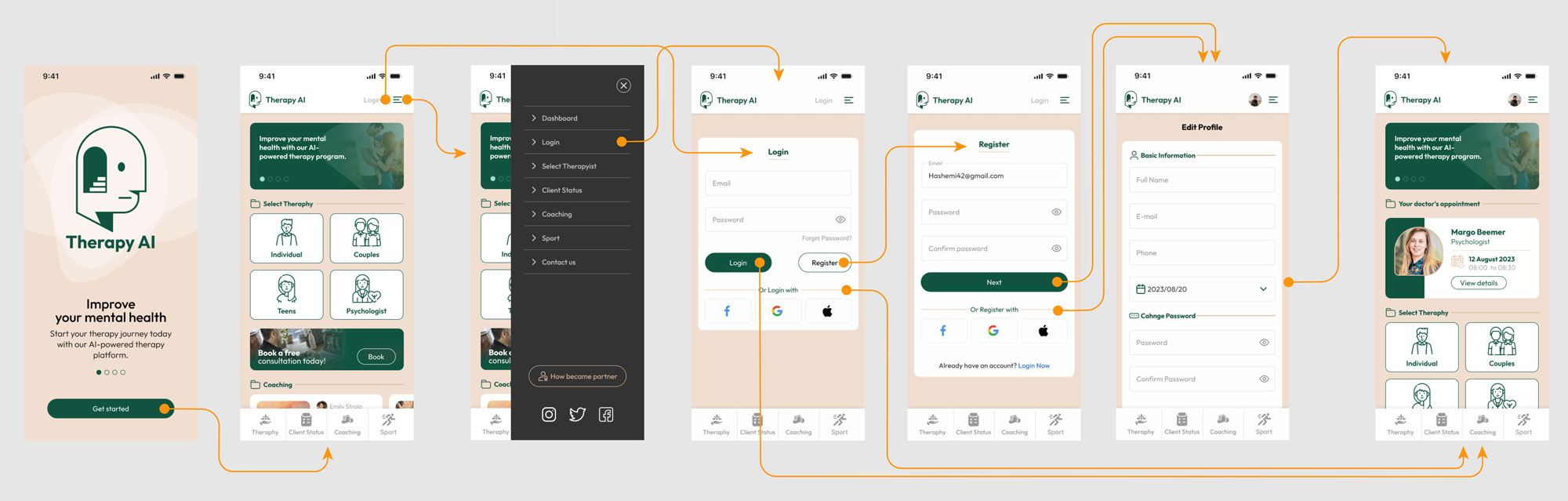
- Onboarding asks what kind of help, not how you are. Individual, couples or teens, then a therapist match. The first screen of a mental health app is the wrong place for a questionnaire.
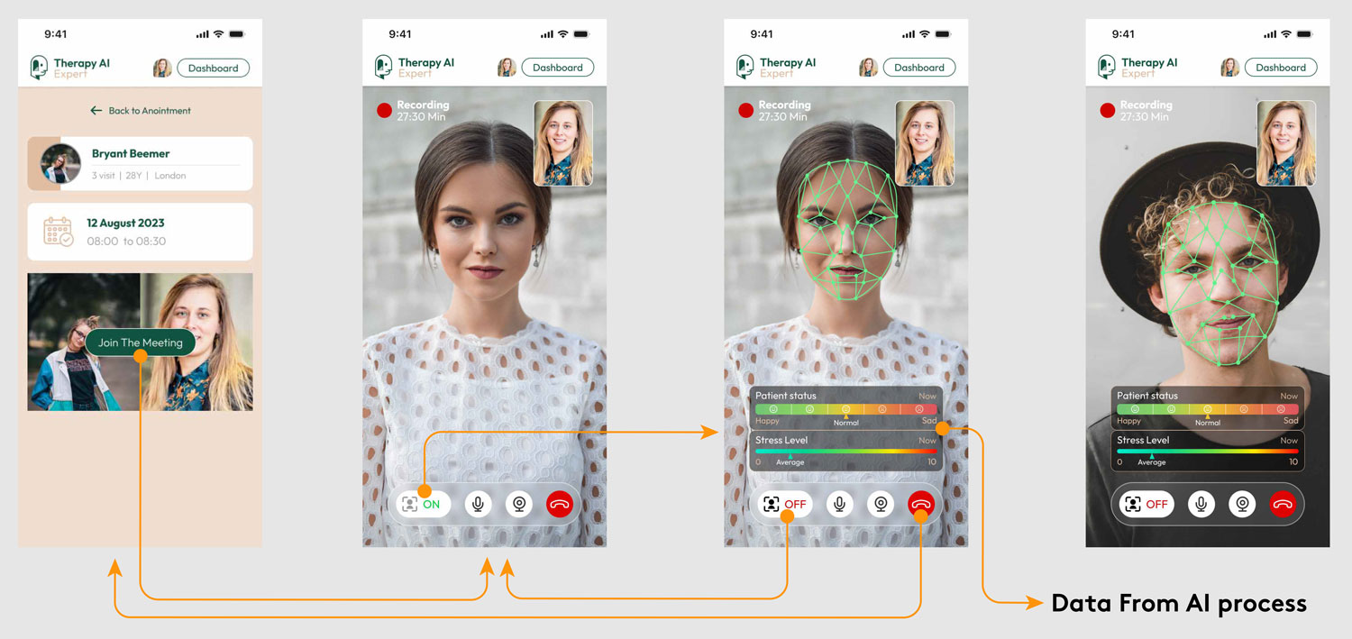
- Session recording stays in the background. The AI processes the conversation to surface emotional triggers for the therapist, and the interface during a session shows almost nothing, because a visible analysis changes what a patient says.
The hardest screen: face recognition
Sessions needed a fast, verified entry for both sides, and the platform used face recognition to get it. Biometrics in a mental health product are a trust problem before they are a technical one: the same feature reads as convenience or as surveillance depending entirely on how it is presented.
Explain first
The flow says why the scan exists before it asks for a face. A biometric prompt with no reason attached is the point where people close the app.
Say what is stored
Copy in the flow states that features such as the shape of eyes and mouth become a mathematical representation, not a stored photograph.
Earn its place
It exists so a therapist joins a session immediately instead of spending the first minutes of an appointment on credentials.
Show the process
Continuous visual feedback while recognition runs. Silence during a biometric check reads as something being done to you.
What I delivered
- Patient dashboard: next appointment and direct access to coaching.
- Therapist profile: working days, availability and professional bio.
- Recording interface: the in-session screen, kept deliberately bare.
Where it stands
The platform was pre-launch when I finished, so there are no usage numbers to report and I am not going to predict any. What exists is the design for both products and the decisions behind them.